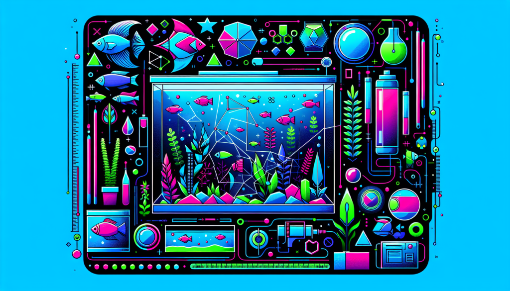
Checklist: Texture and Contrast Setup Done Right
Texture and contrast are the keys to creating captivating aquascapes that draw the eye and provide lasting visual interest. In this comprehensive checklist, we’ll guide you through the essentials for setting up texture and contrast the right way. Whether you’re a beginner or a seasoned aquascaper, these expert tips will help your aquascape stand out and achieve natural harmony.
Why Texture and Contrast Matter in Aquascaping
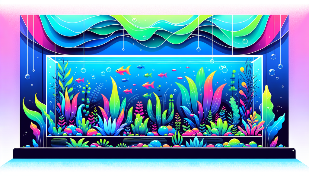
For a truly breathtaking aquarium, achieving dynamic texture and visual contrast is essential. Texture provides depth and realism, while contrast draws attention to focal points and enhances the overall composition. Without these elements, aquascapes can appear flat and uninspired.
- Texture: Adds dimension, simulates natural environments, and enhances plant and hardscape detail.
- Contrast: Highlights different elements, guides the viewer’s eye, and prevents monotony.
Texture and Contrast Setup Checklist
Use this step-by-step checklist to ensure your aquascaping layout achieves the perfect balance of texture and contrast:
1. Select a Variety of Plant Leaf Sizes and Shapes
- Combine plants with fine, feathery leaves (like Hemianthus callitrichoides) with broad-leaved species (such as Anubias)
- Incorporate mid-sized options like Cryptocoryne for smooth transitions
- Mix upright, trailing, and rosette plant forms for layered texture
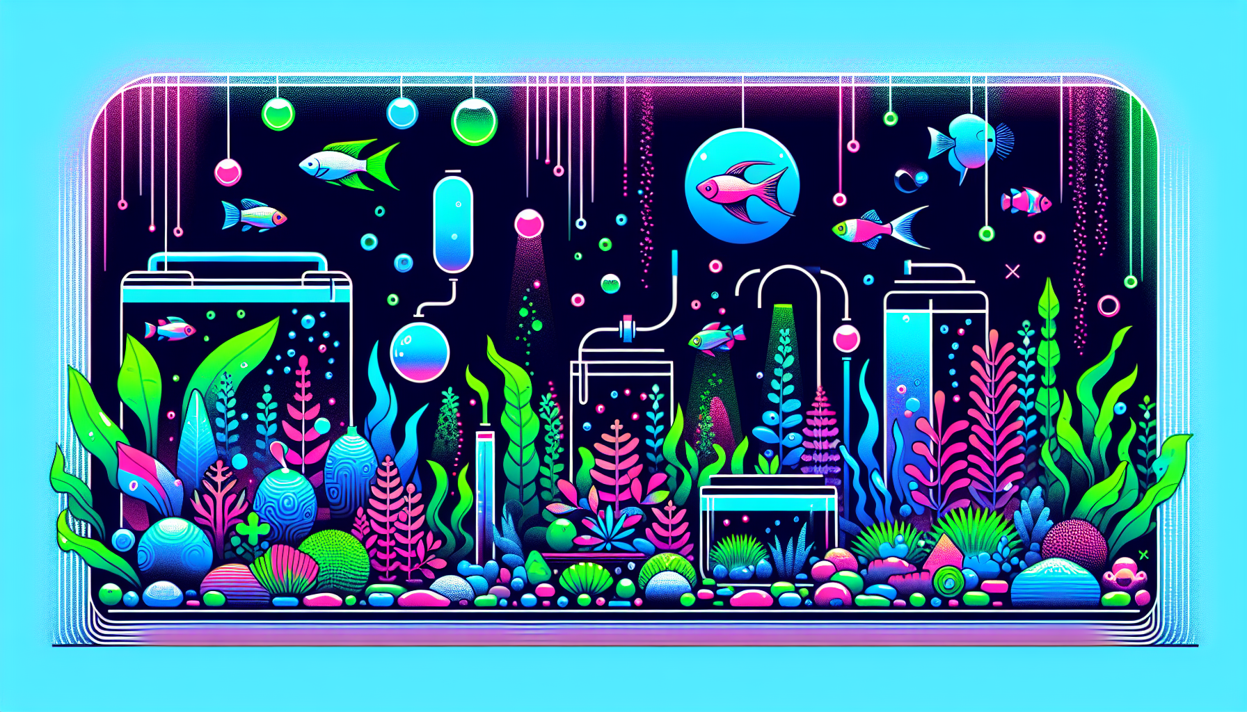
2. Use Diverse Hardscape Materials
- Choose rocks and stones with contrasting textures—rugged Seiryu, smooth river stones, or Dragon Stone for a sculpted look
- Integrate driftwood with natural crevices or gnarled branches
- Blend hardscape materials for a more organic, varied appearance
3. Balance Light and Dark Elements
- Use dark background plants (like Bucephalandra or deep green mosses) behind lighter, foreground plants
- Position light-colored stones or sand adjacent to darker woods
- Layer substrates with varying shades for added depth
4. Pay Attention to Plant and Hardscape Placement
- Group coarse and fine textures in key focal points to create emphasis
- Space contrasting textures to avoid visual clutter
- Stagger heights, blending tall and short elements for a multi-dimensional effect
5. Experiment with Color Contrasts
- Incorporate red or bronze plants (like Ludwigia or Alternanthera) for contrast with green foliage
- Use colored substrates or decorative sand for additional differentiation
6. Routinely Review and Adjust
- Step back to evaluate your aquascape’s overall effect
- Make adjustments as plants grow and textures change over time
- Regularly trim, reposition, or swap elements to maintain dynamic contrast
Common Mistakes and How to Avoid Them
- Relying too heavily on one plant species—diversify for true texture
- Overcrowding contrasting elements—give each focal point room to breathe
- Ignoring the backdrop—backgrounds can greatly enhance contrast
- Forgetting scale—match plant and hardscape size to your tank dimensions
Examples of Texture and Contrast in Popular Aquascaping Styles
- Nature Aquarium: Combine wood, mosses, and delicate stem plants for intricate texture
- Iwagumi: Contrast bold stones with smooth sand and short carpeting plants
- Dutch Style: Use rows of brightly-colored plants with different leaf shapes for striking contrast
Further Reading & Resources
- Aquascaping Principles: The Core Concepts
- Plant Selection Guide for Aquascaping
- Choosing & Using Aquarium Hardscape Materials
Conclusion: Make Texture and Contrast Your Signature
With this checklist, you’re well-equipped to master texture and contrast in your aquascape layout. Refresh your tank by experimenting with new combinations, and don’t forget to document your progress! For more aquascaping tips and community inspiration, check out our aquascaping blog and join our mailing list below.
Ready to Take Your Aquascaping to the Next Level?
Subscribe to our newsletter for expert guides, inspiration, and the latest trends in aquascaping, delivered right to your inbox!