Checklist: Texture And Contrast Setup Done Right
Creating an eye-catching aquascape isn’t just about choosing the prettiest plants or rocks. The interplay between texture and contrast is what truly brings your underwater world to life. Whether you’re a beginner or a seasoned hobbyist, understanding these elements can turn a flat aquarium into a vibrant, dynamic scene. In this comprehensive checklist, we break down the steps you need for a successful texture and contrast setup, ensuring your aquascape stands out for all the right reasons.
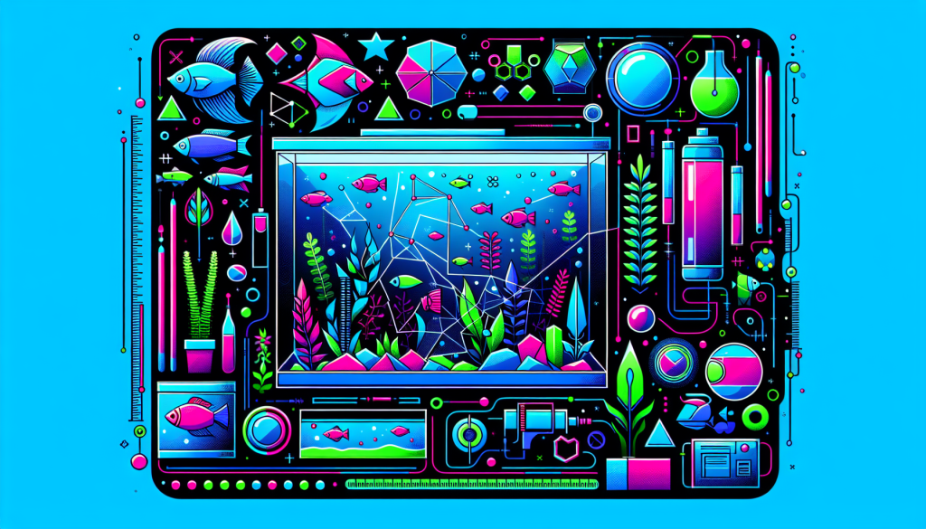
Why Texture and Contrast Matter in Aquascaping
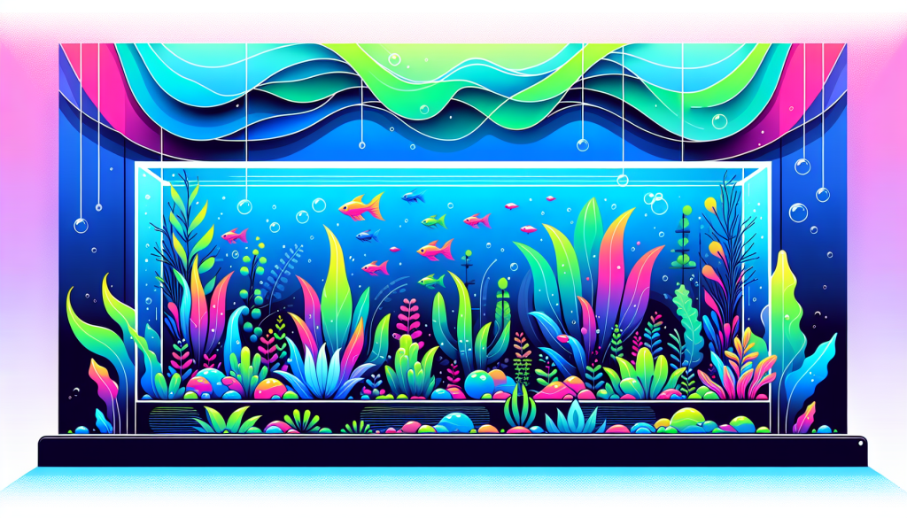
In aquascaping, texture refers to the surface quality of plants, rocks, and hardscape materials—how fine, coarse, smooth, or rugged they appear. Contrast is about how distinct elements stand apart from each other, influencing depth and focus. Together, they:
- Add dimension: Layers, textures, and contrasting elements create the illusion of depth.
- Improve visual flow: Direct the viewer’s eye along focal points and harmonious transitions.
- Highlight features: Make centerpiece plants, stones, or driftwood pop in your aquascape.
For more on crafting depth, visit our aquascaping depth techniques guide.
Texture & Contrast Setup Checklist
Follow this step-by-step checklist to optimize your texture and contrast setup, no matter your aquascaping style!
1. Plan Your Aquascape Layout
- Sketch your aquarium or use digital tools to outline major sections and focal points.
- Decide on your main hardscape arrangement—Iwagumi, nature-style, Dutch, or jungle.
- Note which areas will feature fine vs. coarse textures, and where high or low contrast will work best.
2. Select Hardscape Materials for Textural Variety
- Mix smooth stones (e.g., river rocks) with rugged materials (e.g., Seiryu, dragon stone) for interest.
- Use different driftwood shapes and sizes to break up repetitive lines.
- Arrange rocks and wood strategically to avoid monotony—a mix of vertical, horizontal, and angled pieces works best.
Need hardscape inspiration? Review our beginner hardscape materials guide.
3. Choose Plants with Contrasting Leaf Textures
- Balance fine-leaved species (e.g., Hemianthus callitrichoides, Myriophyllum) with broad-leafed plants (e.g., Anubias, Echinodorus).
- Incorporate grass-like plants, mosses, ferns, and stem plants for a rich textural palette.
- Arrange plants in clusters but avoid heavy grouping of similar textures in one area.
4. Maximize Contrast Through Color and Height
- Pair light-green plants with deep-green or reddish varieties for dynamic visual impact.
- Stagger foreground, midground, and background species to reinforce depth and separation.
- Mix tall, airy stems with low, dense carpeting plants for height contrast.
Learn which foreground and background plants work best in our aquascaping plants guide.
5. Layer and Transition Elements Smoothly
- Blend coarser materials at the base with finer substrates or delicate plants at the top.
- Use transitional plants or mosses to soften harsh lines between hardscape and substrate.
- Avoid abrupt, unnatural jumps from one texture to another.
6. Use Negative Space to Create Emphasis
- Leave some open areas in the substrate or background so textured and contrasting elements stand out.
- Negative space prevents visual clutter and highlights focal points.
Explore our layout principles article for more insight on negative space.
7. Assess Your Work from Different Angles
- Step back and evaluate your aquascape from various viewpoints.
- Ensure textures and contrasts are apparent from the front and slight angles—not just one perspective.
8. Make Adjustments as Plant Growth Evolves
- Trim, prune, or replant as needed to maintain original texture and contrast balance.
- Be observant—some fast-growing species may outpace others and disrupt your design.
- Consider periodic rescapes or refreshes for long-term vibrancy.
Pro Tips for Texture and Contrast Mastery
- Lighting: Subtle, angled lighting accentuates surface textures and cast shadows for added contrast.
- Foreground Focus: Pay extra attention to texture in the foreground to anchor the viewer’s gaze.
- Color Coordination: Contrasting colors can double as contrast, but ensure colors aren’t overwhelming or clashing.
Common Mistakes to Avoid
- Overcomplicating: Too many textures or contrasts can overwhelm and confuse the eye.
- Lack of Balance: Focusing too much on one side can disrupt harmony and flow.
- Ignoring Growth Patterns: Some plants morph in shape and size—adjust your setup as they mature.
Conclusion: Achieve Stunning Texture and Contrast in Your Aquascape
Texture and contrast are essential to successful aquascaping, elevating your aquarium from basic to breathtaking. By following this checklist, you’ll build a balanced, visually compelling layout that remains attractive over time. Remember, a truly effective aquascape is as much about what you include as what you artfully leave out. Experiment, observe, and don’t be afraid to tweak your setup for continuous improvement.
Ready to take your aquascaping skills to the next level? Explore our beginner tips and in-depth advanced techniques for even more inspiration. Share your progress with the Aquascaping Academy community and let your creativity flourish!
Join our newsletter for exclusive aquascaping guides, tips, and contests delivered straight to your inbox.